Product design · Brand systems · Web and launch
Trophy
Fishing
Building an original card game into a connected product, brand, and digital experience.
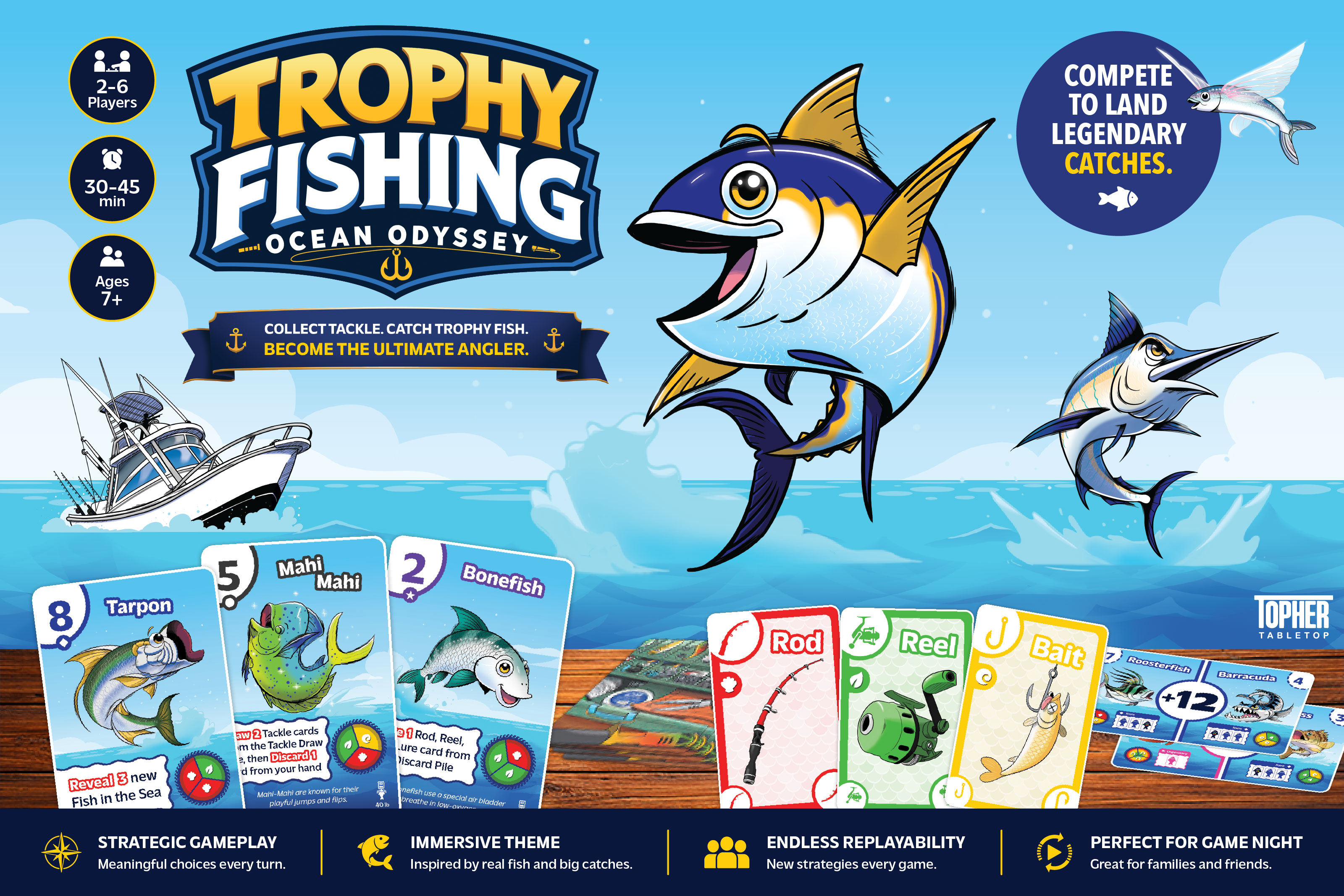
Trophy Fishing: Ocean Odyssey is a strategic card game for 2 to 6 players, designed for 30 to 45 minute game nights. I lead the game design and creative direction, connecting the player experience with the way the product is presented online and in print.
01 · Design challenge
Easy to learn. Worth mastering.
Create a fishing game with meaningful choices and a quick learning curve, using cards as the foundation. The challenge was to communicate catch requirements, scoring, rarity, and effects clearly while balancing luck with strategy.
My responsibilities span game mechanics, rules and instructions, component layouts, playtest facilitation, gameplay balancing, visual direction, and product development. Jesse Soto creates the illustrations that give the fishing world its character.
This required thinking about both the player and the prospective customer: what someone needs to understand during a turn, and what they need to see before deciding to try the game.
02 · Information design
A visual system players can read.
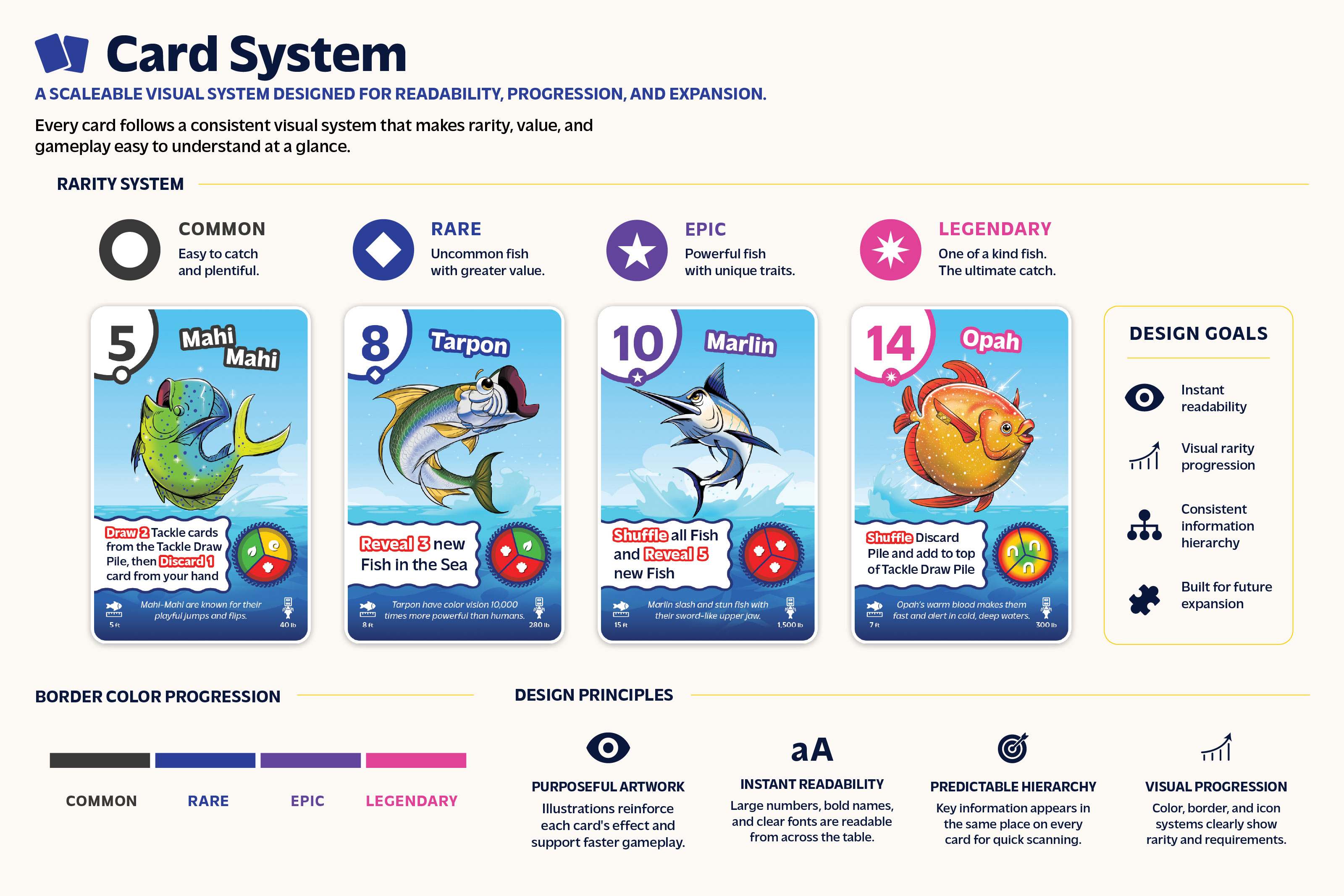
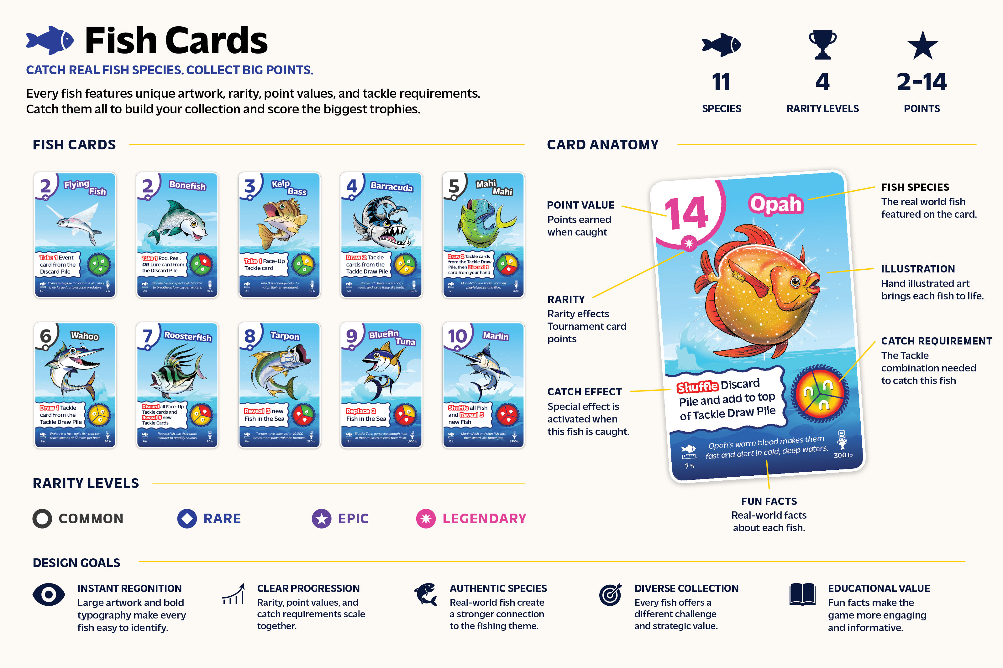
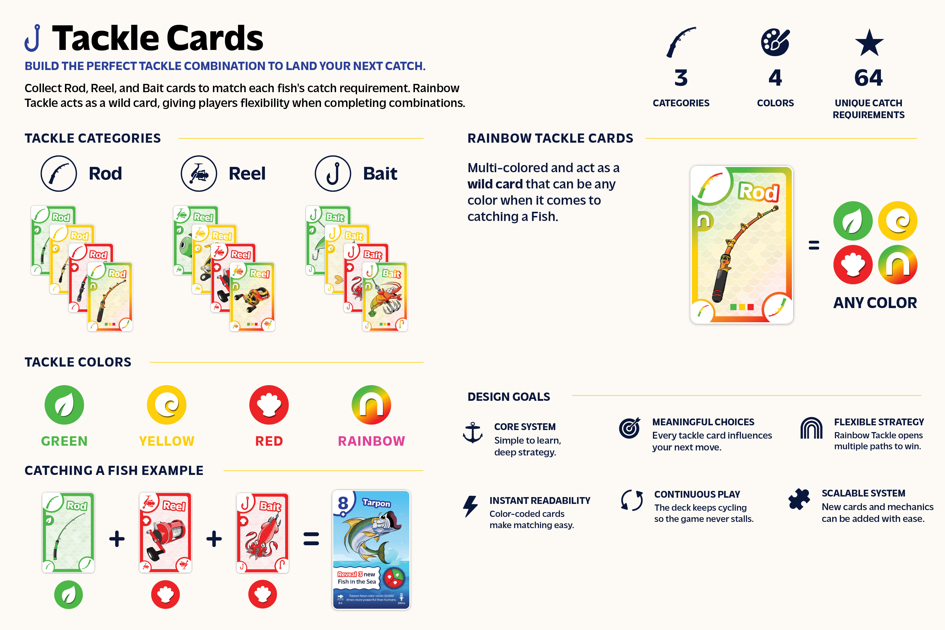
Each card type follows a consistent information hierarchy. Color, icons, typography, and layout help players find catch requirements, point values, rarity, and effects quickly.
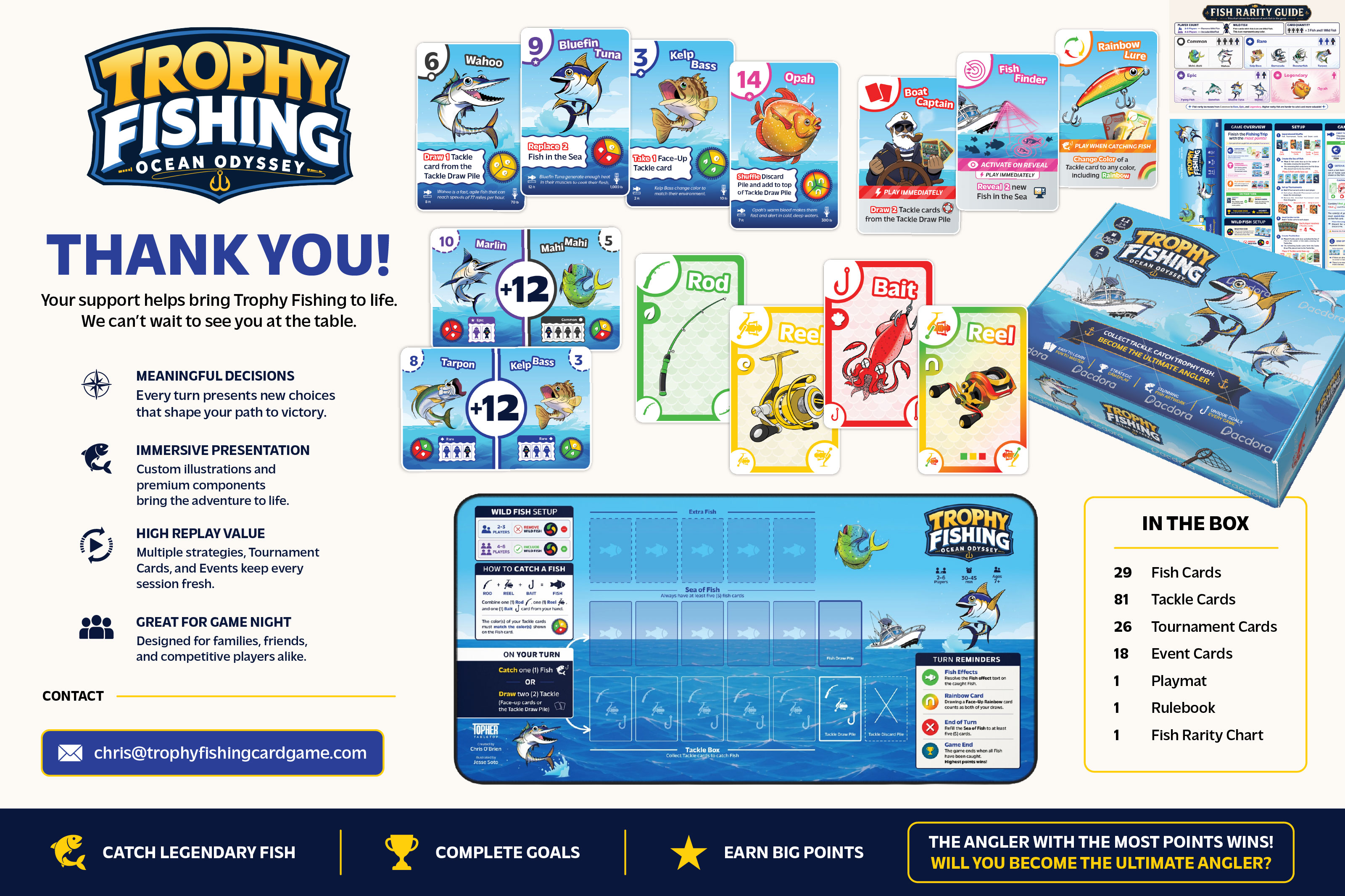
Fish cards organize species, scoring, requirements, and abilities. Tackle cards use repeated Rod, Reel, and Bait symbols with color coding. Tournament and Event cards extend the same visual language to scoring goals and special actions.
The system makes the different components feel connected and provides a foundation for future cards and expansions.
03 · Design and playtesting
Build. Test. Refine.
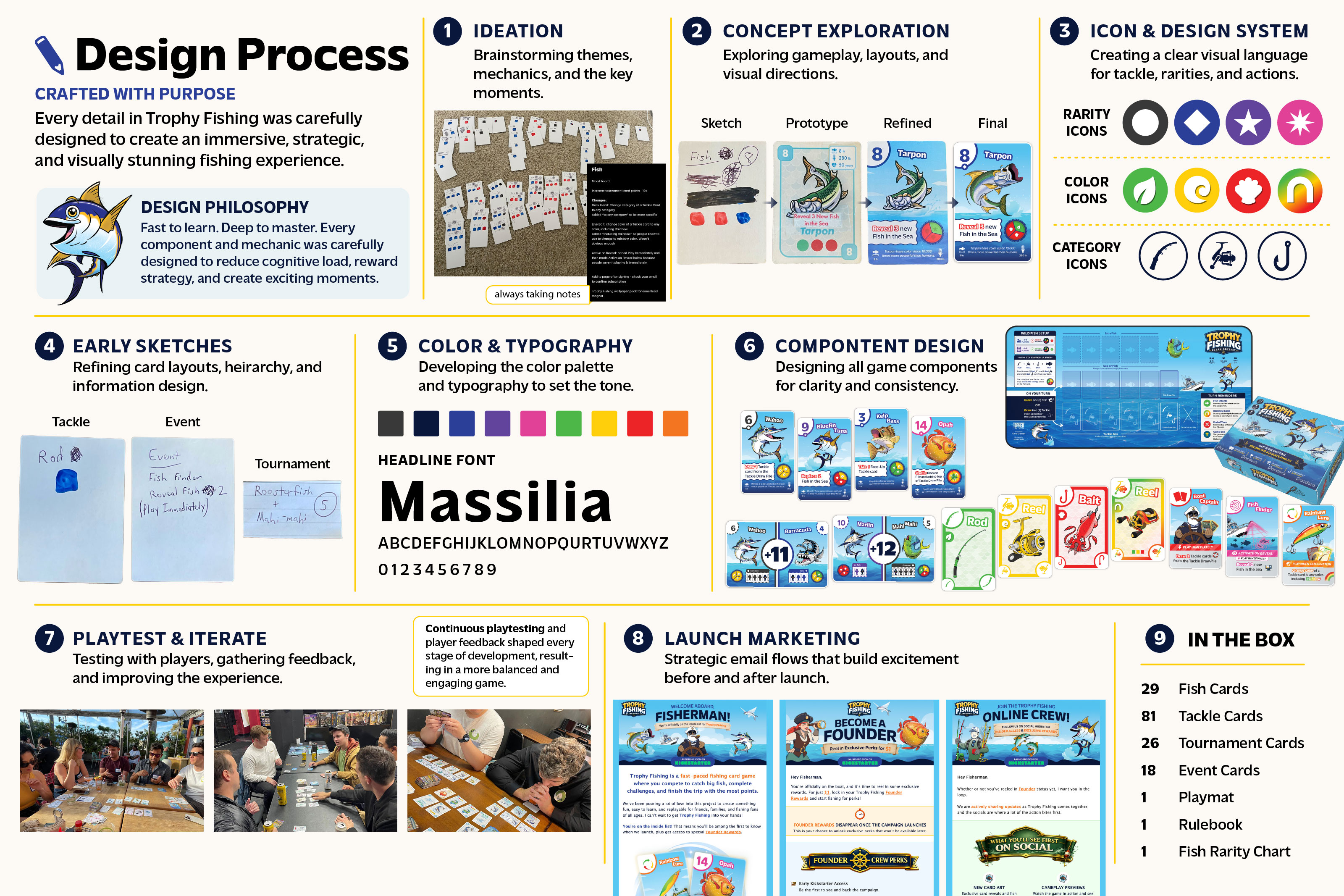
The design moved from early concepts and paper prototypes into a complete component system. I used repeated playtesting and player feedback to refine rules, game balance, card layouts, and the overall experience.
The goal was to make decisions feel rewarding while reducing the effort needed to understand a turn. Gameplay and visual design evolved together, so the information on each card supported how people actually played.
The process board below traces research, prototypes, color and typography, component design, playtesting, and launch materials. It shows the work behind the finished presentation.
04 · Brand and packaging
One identity. Across every touchpoint.
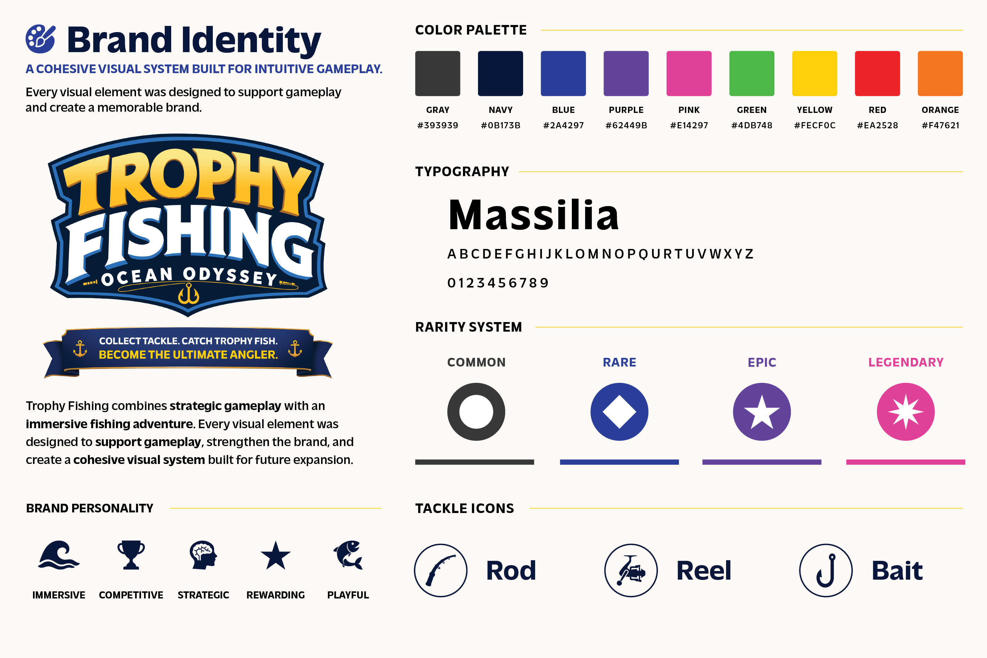
I built a visual identity that could carry the product from the table to the website. The logo, color palette, typography, icons, and rarity cues keep the adventurous fishing theme consistent across components and marketing materials.
Card layouts, rules, packaging, product displays, and launch assets use that shared language. The aim is to help someone recognize the game and understand its appeal wherever they first encounter it.
Tools include Illustrator, Photoshop, Figma, Google Docs, and print production workflows, alongside Webflow for the website.
05 · Web and launch preparation
Make the game easy to explore.
The website extends the same visual system into a digital introduction to the game. Product imagery and clear explanations connect the brand story with the experience of playing.
The interactive how to play guide uses a visual walkthrough to explain collecting Tackle and catching Fish. It is another way to translate the product’s mechanics into an approachable web experience.
For launch preparation, I am bringing together the website, rules content, product presentation, and Kickstarter materials so prospective players can understand the game and follow its progress.
06 · Current status
Preparing for the next chapter.
Trophy Fishing is currently in development and preparing for a Kickstarter launch. Artwork, gameplay, and components may continue to change as the product is refined.
The work demonstrates how I connect product design, a visual identity, print production, a website, and marketing assets around one idea. Sales and Kickstarter results are still ahead.